


PT.
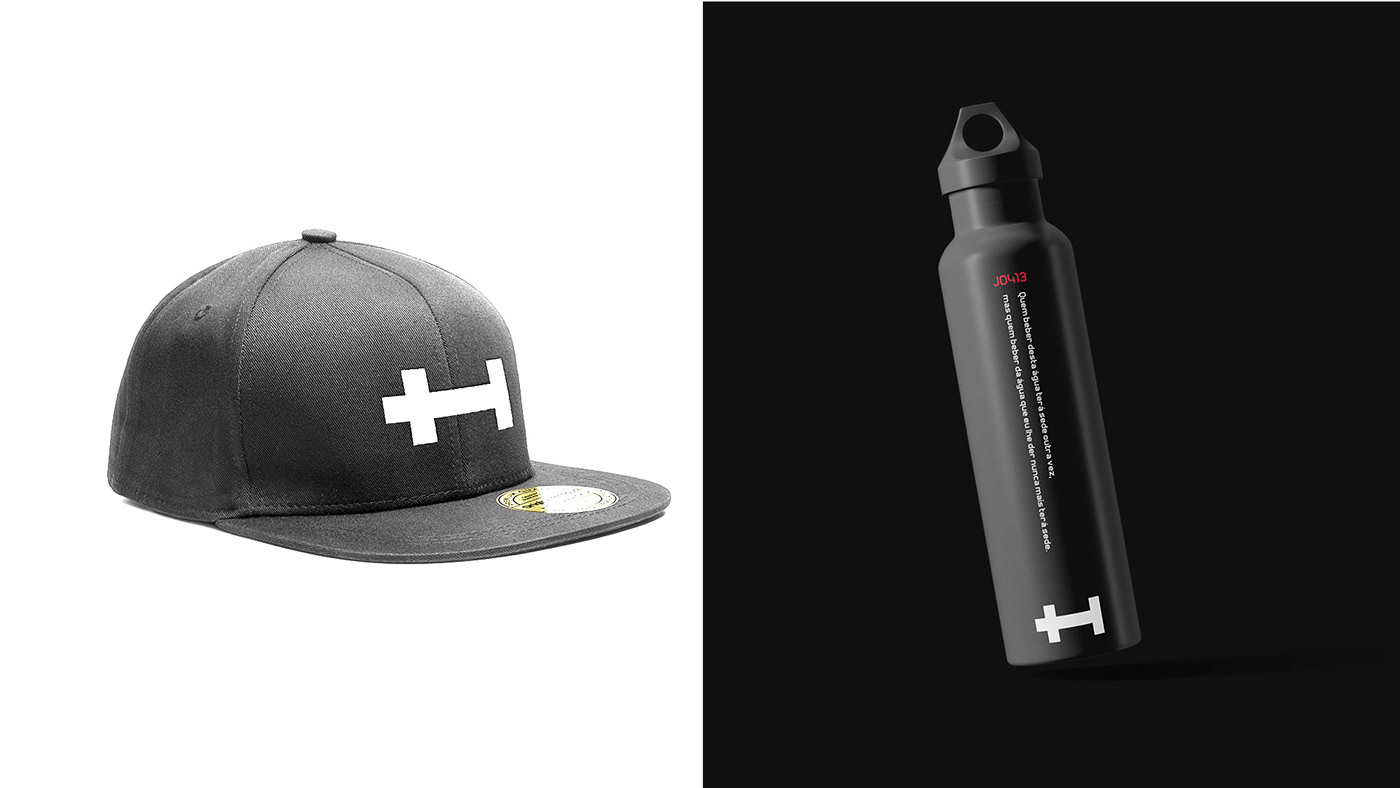
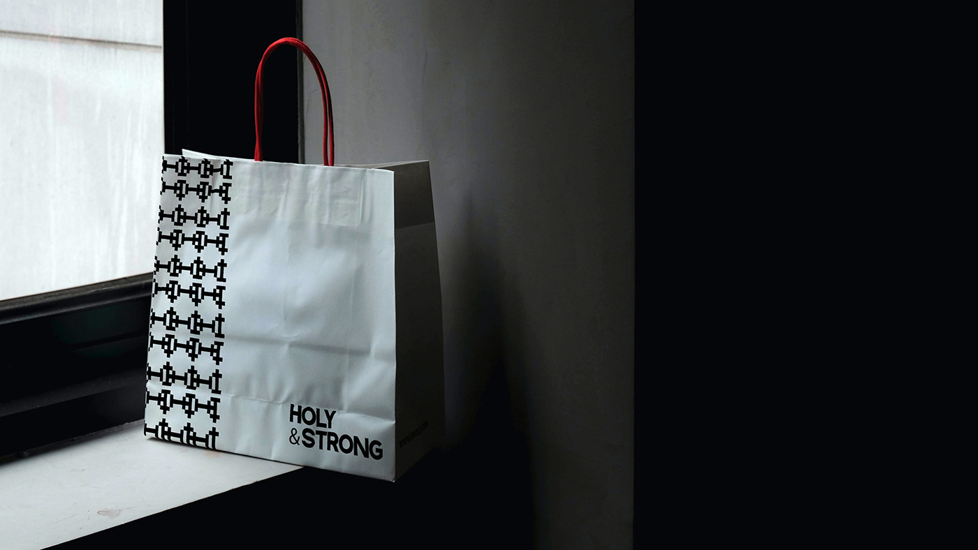
O conceito da marca era ser elegante e forte pois seria destinada ao público fitness e cristão. A solução que encontramos foi criar um símbolo minimalista geométrico com uma tipografia robusta para transmitir essa sensação. A paleta com cores sobrias em contraste com um vermelho vivo transmite força à marca e traz dinamismo à comunicação. No slogan e nas composições trouxemos trechos das escrituras cristãs para conectar a marca com o público escolhido. Essa é a Holy&Strong.
-
EN.
The brand concept was to be elegant and strong as it would be aimed at the fitness and Christian audience. The solution we found was to create a minimalist geometric symbol with a robust typography to convey this feeling. The palette with sober colors in contrast with a bright red transmits strength to the brand and brings dynamism to the communication. In the slogan and compositions we brought excerpts from Christian scriptures to connect the brand with the chosen audience. This is Holy&Strong


OBRIGADO PELA ATENÇÃO.
THANKS FOR YOUR ATTENTION.
-
Projeto: Identidade Visual
Cliente: Holy&Strong
Direção de Arte & Design: Luiz Galli


